Pedro Cardillo, the London-based, Brazilian-born director of photography on lensing the Sophie Turner starring show “Joan”,
It all starts with the concept. No audiovisual piece can be consistent without being faithful to its core.
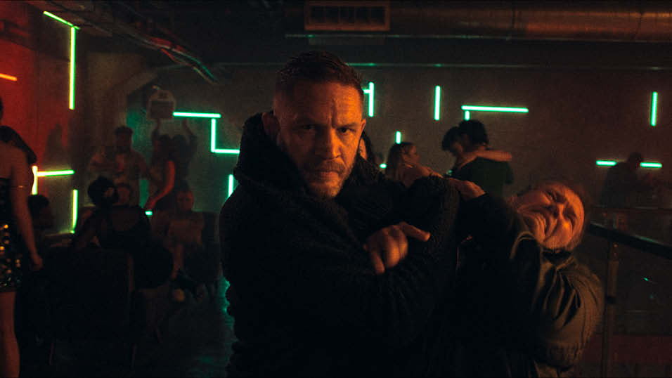
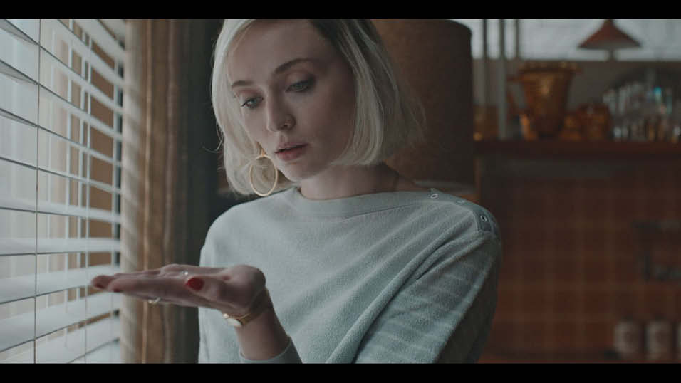
JOAN (2024), starring Sophie Turner (Game of Thrones), is a story about a woman divided between two worlds: the glamorous, exciting life of a jewel thief and the challenging, emotional journey of a single mother trying to recover her daughter from care.
Based on the fantastic life of Joan Hannington, 1980s London’s most notorious diamond thief, the series was written by Anna Symon (Essex’s Serpent, Mrs Wilson) and directed by Richard Laxton (Rain Dogs; The Thief, His Wife and The Canoe, Mrs Wilson)
To honour such an extraordinary story, the cinematography had to create compelling, sexy, and yet dramatic images while taking an honest and kind approach to her drama. It was all about creating a faithful and cohesive visual concept that would keep the show consistent and exciting throughout its six one-hour episodes.
My process usually involves searching for inspiration from all art forms, such as cinema, photography, painting, music, poetry, etc., that match how I felt while reading the scripts. Meanwhile, I conduct historical visual research to find parameters that make sense in that era and will help me tell the story visually.
As great and truthful representatives of the 80s, Brian de Palma’s Scarface (1983, cinematography by John A. Alonzo, ASC) and Wim Wenders’s Paris, Texas (1984, cinematography by Robby Müller, NSC, BVK) were essential references for creating the visual concept for Joan, thanks to their bold use of colours and design, as well as the framing and composition.
For the glamour and excitement of Joan’s dangerous life, Martin Scorcese’s Casino (1995— cinematography by Robert Richardson, ASC) was a great reference: classical film language at its best. With precise framing, dolly moves, cranes, and clever breakdowns, this visual style belonged to an essential part of Joan’s life: the thief.
Nevertheless, Joan’s struggles as a woman on the move, fighting for her life and her child, needed a more delicate and organic approach. The camera work and visuals of Dennis Villaneuve’s Arrival (2000—cinematography by Bradford Young, ASC) were a great source of inspiration, and they suit another vital aspect of Joan: the mother.
Creating a visual concept relies on researching for references, inspiration and collaboration between the cinematographer, the director, and the production designer. Trust and generosity are essential elements in helping foster a creative environment so that we can rely on each other’s feelings and ideas to create the world that Joan lived in.
I was fortunate to work with the talented director Richard Laxton, who shared the same feelings about Joan’s journey with me. Our collaboration was key to finding the right tone for the project: always being close to Joan, truthful to her feelings, and avoiding over-stylising the 1980s, an exciting era divided between economic depression, the Cold War, and a colourful, frivolous pop life.
Since theory can’t exist without practice, it’s time to test everything, from lenses and cameras to lighting techniques or fabrics and textures, and make sure the visual concept created is


technically and artistically attainable. As a cinematographer, the promises made during prep must be fulfilled during the shooting.
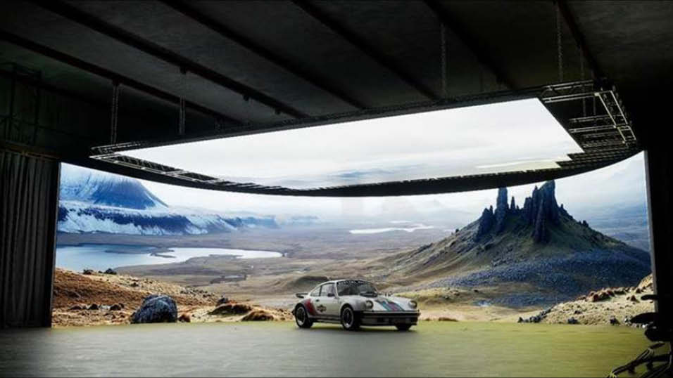
The goal was an image with a soft contrast look and gentle skin tones, so vintage lenses made sense. We avoided optical aberrations or anything that could distract the audience from Joan’s journey and feelings. Although vintage, the lenses should have a nice technical performance and not be too characteristic.
After extensive glass testing involving anamorphic, large format, and super35mm lenses, I chose the Moviecam primes set, a vintage lens from the 1980s provided by Arri Rental UK. I decide on it because of its softness, although with plenty of detail, its beautiful bokeh, and the smooth fall-off.
My camera choice was the Alexa Mini LF due to its large-format sensor and overall image rendition, especially the highlights and skin tones. Since most of the show would be shot in interiors, a larger sensor (and its shorter depth of field) was a natural choice to separate the actors and the sets.
To develop the show’s look, I joined forces with Jat Patel, a colourist at Harbor Picture Co.. Using footage from our hair and makeup test with the cast and based on our visual references, Jat and I explored some different options until finding the look we wanted: soft contrast, lifted blacks, and muted colours. Having an early 90s Fuji film stock as the base, we could achieve the look we wanted for Joan.
The importance of creating the visual concept can’t be understated. Since we are creating a “new world, ” we must have a set of rules, the DOs and DONTs, so all of our choices will make sense during the shooting. It’s like music: every song has its key, and within this key, not all, but just some notes will fit perfectly.
I see the director of photography as the guardian of the visual concept of the audiovisual piece: camera behaviour, framing, composition, lighting, colours, contrast, and tone. Being truthful to the visual concept of the character’s journey throughout one hour six episodes is a key element of the cinematographer’s role.


Jon Creamer
Share this story